potato <- read.csv(here::here("data", "potato_tuber_size.csv"))14 Variance & Variance Components
Mixed, hierarchical or multilevel models provide the advantage of being able to estimate the variance of random variables and model correlations within the grouping structure of random variables. Instead of looking at a variable as a collection of specific levels to estimate, random effects view variables as being a random draw from a probability distribution.
The decision of how to designate a variable as random or fixed depends on (1) your experimental aims with regard to inference and (2) your data structure. 1 There is a philosophical consider and practical consideration. The philosophical approach is that random variable represents a small sample of a population you want to make inference on. The practical consideration is that when there are few sample levels, the random estimation procedure is not very reliable for those conditions. Ben Bolker has an excellent summary that we strongly recommend that you read to learn more about this. Below is an excerpt from that on the consequences of having too few levels to estimate a random effect well:
1 This animation show how accounting for grouping structure as random effects can impact the results of a linear model.
Treating factors with small numbers of levels as random will in the best case lead to very small and/or imprecise estimates of random effects; in the worst case it will lead to various numerical difficulties such as lack of convergence, zero variance estimates, etc.. (A small simulation exercise shows that at least the estimates of the standard deviation are downwardly biased in this case; it’s not clear whether/how this bias would affect the point estimates of fixed effects or their estimated confidence intervals.) In the classical method-of-moments approach these problems may not arise (because the sums of squares are always well defined as long as there are at least two units), but the underlying problems of lack of power are there nevertheless.
14.1 Variance component estimation for 2 or more random effects
14.1.1 Multiple crossed variance components
This is a common scenario: an experiment is conducted and there are multiple grouping levels, none of which are nested within each other, but the observations have multiple group memberships. A common example is a multi-environmental trial where multiple crop genotypes are evaluated at multiple locations and years. We can consider genotypes, locations and years as random effects depending on our experimental aims. Very few R packages can handle crossed random effects, but ‘lme4’ can.
The data used in the next example is a collection of potato field trials conducted across 3 locations and 17 years. Each year, the same potato clones2 are evaluated across all 3 locations, but each year different clones are evaluated. Some clones are evaluated for multiple years, and a small number are evaluated every year. These potato clones were evaluated for the length-to-width ratio. We want to know how much location, year and clone contribute to this trait.
2 A clone is a genetically distinct potato genotype that is vegetatively propagated. It may be a released variety or an experimental breeding line.
| year | year of trial, 16 levels |
| state | location of trial, 3 levels |
| clone | potato genotype |
| iLxW | inverse length-to-width ratio |
Number of observations for each location and year and their marginal sums:
addmargins(table(potato$year, potato$state))
         ID   OR   WA  Sum
  2005   30   30   30   90
  2006   30   30   30   90
  2007   29   29   29   87
  2008   25   25   25   75
  2009   16   17   17   50
  2010   28   28   28   84
  2011   18   24   26   68
  2012   30   32   32   94
  2013   24   25   25   74
  2014   33   33   33   99
  2015   29   31   31   91
  2016   25   25   25   75
  2017   18   21   22   61
  2018   25   25   25   75
  2019   22   23   23   68
  2020   23   24   24   71
  Sum   405  422  425 1252
Total number of clones evaluated:
length(unique(potato$clone))[1] 181Total counts for how often individual clones were evaluated:
potato |> count(clone, name = "Frequency of Evaluation") |>
  count(`Frequency of Evaluation`, name = "No. of Clones")
Frequency of Evaluation No. of Clones
1 2 4
2 3 92
3 4 1
4 6 30
5 8 2
6 9 20
7 10 1
8 11 2
9 12 11
10 13 1
11 14 4
12 15 8
13 16 1
14 17 1
15 18 1
16 91 1
17 93 1The distribution of the dependent variable, length-to-width ratio, had a slight left skew, so the the inverse of this trait was modeled.
hist(potato$iLxW, ylab = NULL, xlab = NULL, main = NA, breaks = 20)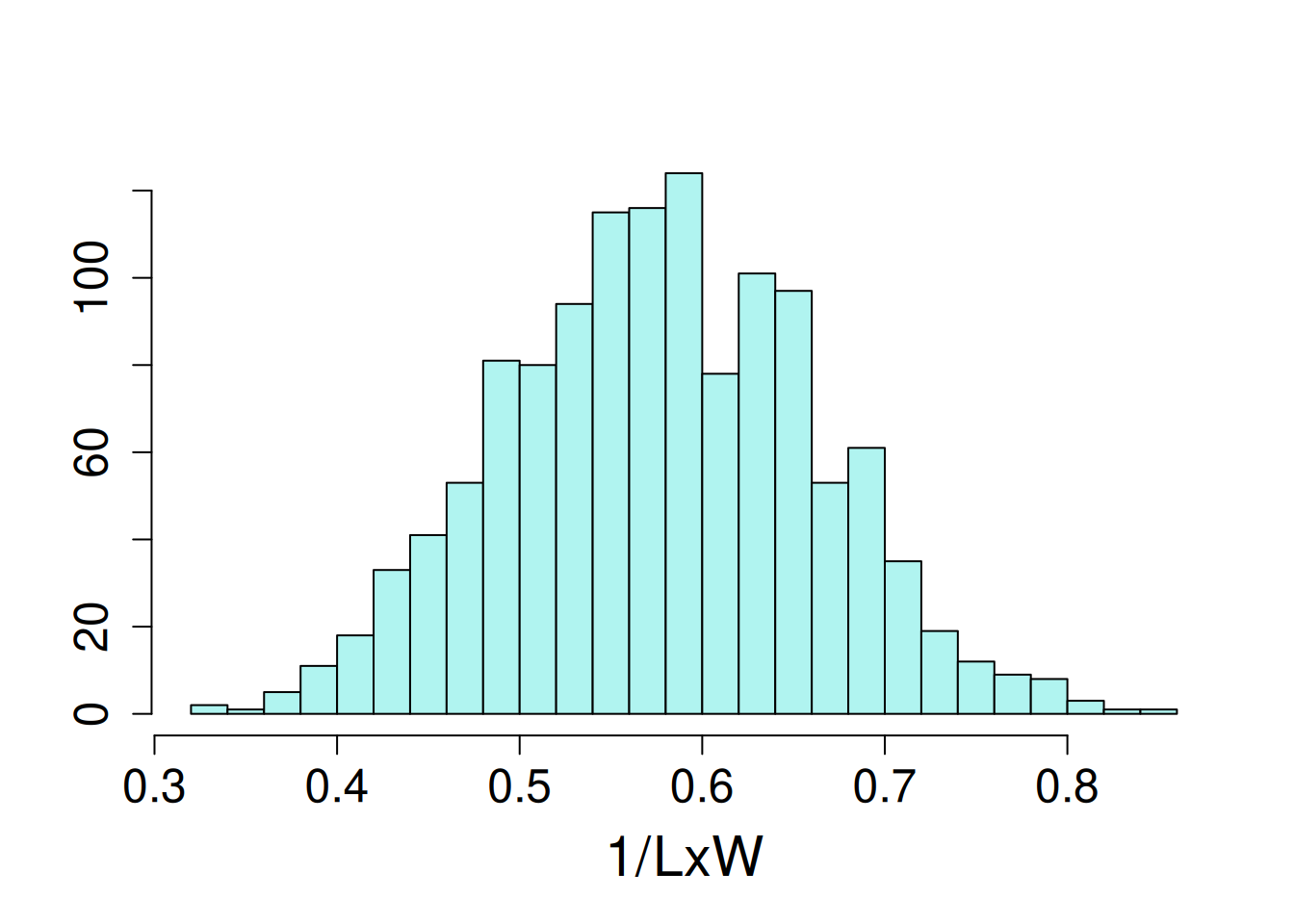
14.1.1.1 Model fitting
For this analysis, location (“state”) is a fixed effect because it only has 3 levels, and the researchers were only interested in understanding clone performance in those locations (Idaho, Oregon and Washington). The remaining effects are random because (1) they represent a sample of the full population that inference is desired for, and (2) each has a sufficient number of levels to make estimation of random effects feasible.
The statistical model:
\[ y_{ijk} = \mu + \alpha_i + b_j + (\alpha\beta)_{ij} + \gamma_k + \epsilon_{ijk}\]
\(\mu\) = model intercept
\(\alpha_i\) = fixed effect of state (3 levels)
\(\beta_j\) = random effect of year (16 levels)
\((\alpha\beta)_{ij}\) = random effect of state-by-year interaction (48 levels)
\(\gamma_k\) = random effect of clone (181 levels)
\(\epsilon_{ijk}\) = error term
The error terms and all random effects are normally distributed with a mean of zero and a given variance for each term:
\[ \epsilon \sim \mathcal{N}(0, \sigma^2) \] \[ \beta \sim \mathcal{N}(0, \sigma^2_b) \] \[ (\alpha\beta) \sim \mathcal{N}(0, \sigma^2_a) \] \[ \gamma \sim \mathcal{N}(0, \sigma^2_g) \]
lme4 Syntax
potato_m1 <- lmer(iLxW ~ state + (1|year) + (1|state:year) + (1|clone),
                  data = potato)
Evaluation of model assumptions:
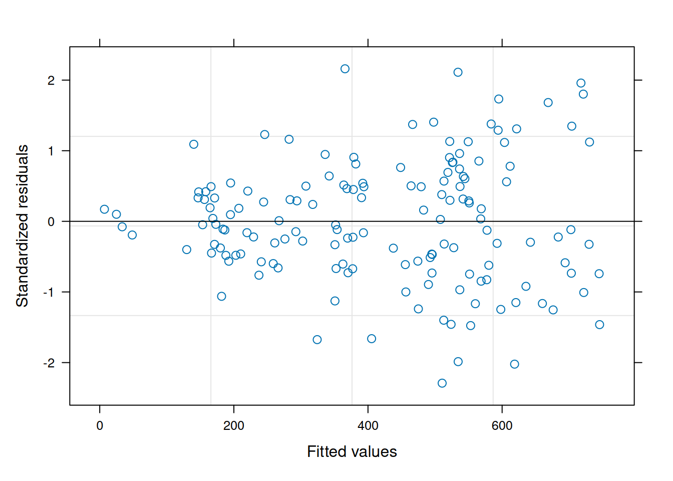
performance::check_model(potato_m1,
                         check = c('qq', 'linearity', 'reqq'),
                         detrend = FALSE, alpha = 0)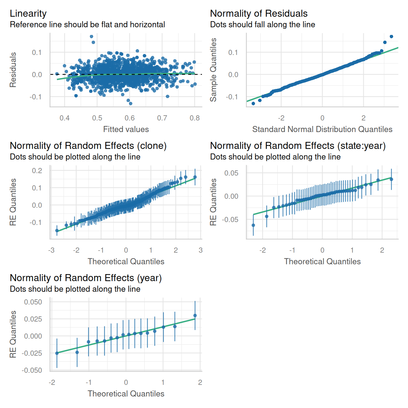
14.1.1.2 Inference on random effects
Marginal means of fixed effects can be visualized as demonstrated in previous chapters (e.g. marginal means and constrasts).
The variance components for each random effect can be extracted most easily using the tidy() function from ‘broom.mixed’. We can also a bit of extra code to calculate the percent of variance explained by each component.
var_comps <- tidy(potato_m1, "ran_pars", scales = "vcov") |>
  dplyr::select(group, variance = "estimate") |>
  mutate(`percent variance` = round(variance/sum(variance) * 100, 1))

var_comps
# A tibble: 4 × 3
group variance `percent variance`
<chr> <dbl> <dbl>
1 clone 0.00344 61.6
2 state:year 0.000468 8.4
3 year 0.000301 5.4
4 Residual 0.00138 24.6This is a naive method to estimate relative variance components; in particular, heritability estimates should also take into account the number of locations and year.
Notelog likelihood ratio tests
ANOVA as classically defined (F-tests contrasting the between group and within group variation) is not an option for evaluating random effects. There are several ways to test if random effects are impactful on the model overall. One of the most reliable and popular methods is the log likelihood ratio test. In brief, a reduced model is refit from a full specified model omitting a random variable. The log likelihood from the two models (the fully specified and reduced models) are compared, and a p-value is computed for that difference given the change in number of parameters estimated. The null hypothesis is that the models are equivalent and the alternative hypothesis is that the models are not equivalent. Hence, low p-values provide evidence that the omitted factor is impactful on the dependent variable of interest.
The function ranova() in ‘lmerTest’ conducts log-likelihood ratio tests for all random effects in a model.3
3 It is also possible to conduct log-likelihood tests manually by constructing reduced models and comparing them to the fully specified (or more specified) model. In such cases, the fixed effects need to be identical between models, and the models need to be fit using maximum likelihood instead of REML.
ranova(potato_m1)ANOVA-like table for random-effects: Single term deletions
Model:
iLxW ~ state + (1 | year) + (1 | state:year) + (1 | clone)
npar logLik AIC LRT Df Pr(>Chisq)
<none> 7 2041.9 -4069.7
(1 | year) 6 2039.3 -4066.7 5.07 1 0.02436 *
(1 | state:year) 6 1953.7 -3895.4 176.34 1 < 2e-16 ***
(1 | clone) 6 1477.3 -2942.7 1129.03 1 < 2e-16 ***
---
Signif. codes: 0 '***' 0.001 '**' 0.01 '*' 0.05 '.' 0.1 ' ' 1It is possible to make inferences on specific levels of random effects. This take a different analytical approach than fixed effects and has a different term, predictions, or more specifically Best Linear Unbiased Predictions, commonly called “BLUPs” (rhymes with “cups”). The estimated marginal means from fixed effects are technically BLUEs, or Best Linear Unbiased Estimates. By their nature, BLUPs “shrink” the estimates towards zero, reducing their overall spread compared to fixed effects. VSNi has a short summary on BLUPs and BLUEs.
Recall that random effects are distributed with a mean of zero and a variance \(\sigma^2_x\) that is estimated in the model fitting procedure. We can add the overall model intercept to all BLUPs in order to shift them to a scale that may be more intuitive for some. Since this constant (the model intercept) was added to all BLUPs, the overall relationship between the them is unchanged.
# the model intercept
intercept = fixef(potato_m1)[1]

# all random effects from the model
random_effects <- REextract(potato_m1)

# filter to clone BLUPs and add the intercept
clone_re <- filter(random_effects, groupFctr == "clone") |>
  rename(clone = groupID, BLUP = "(Intercept)", SE = "(Intercept)_se") |>
  mutate(blup_adj = BLUP + intercept)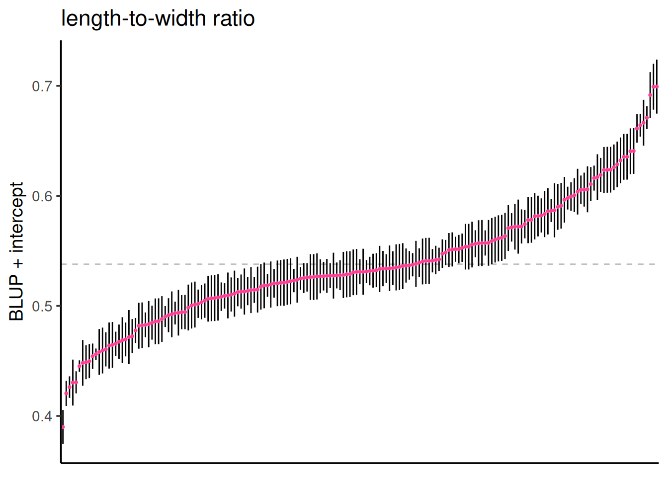
Below are the BLUPs (in red) and standard errors for each clone, arranged from lowest to highest length-to-width ratio. The horizontal gray dotted line indicates the average clone effect.
ggplot(clone_re, aes(x = reorder(clone, blup_adj), y = blup_adj)) +
  geom_hline(yintercept = intercept, color = "gray", linetype = 2) +
  geom_linerange(aes(ymax = blup_adj + SE, ymin = blup_adj - SE), color = "gray30", linewidth = 0.3) +
    geom_point(size = 1.5, col = "violetred1", alpha = 0.6, shape = 18) +
  theme_classic(base_size = 14) +
  labs(title = "length-to-width ratio", sub = "clone BLUPs and standard errors") +
  ylab("BLUP + intercept") +
  xlab("individual clones") +
  theme(axis.text.x = element_blank(),
        axis.ticks.x = element_blank())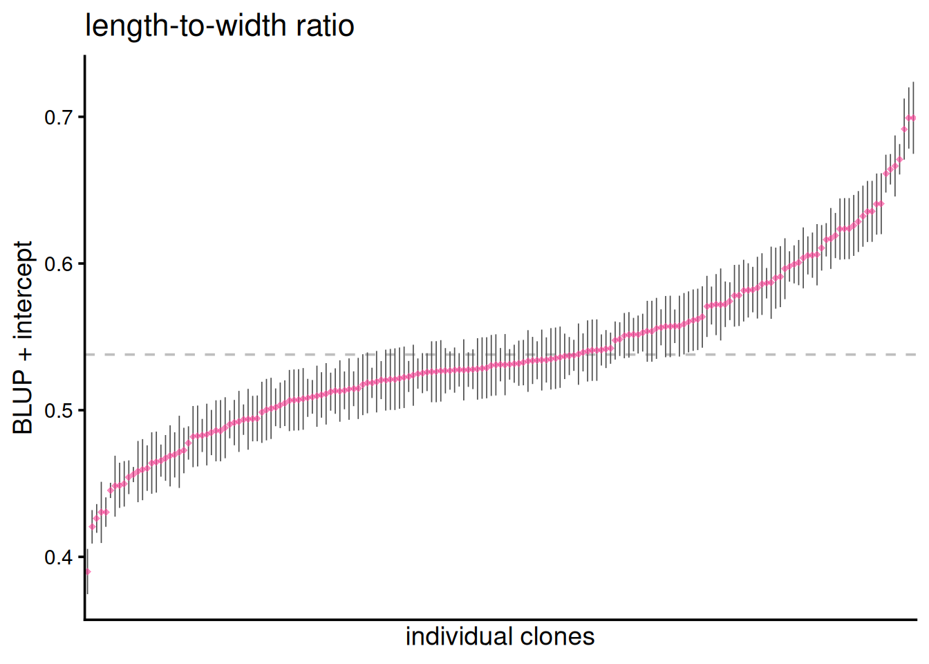
14.1.2 Nested variance components
It is possible to have a nested data set: learners in a classroom and classrooms in institutions, cows in dairies and dairies in counties or other regional indicators. These are truly hierarchical models, where we expect that there is some covariance between observations at the different levels. Cows in the same dairy are likely to be more correlated with each other than cows from another dairy. But how correlated? And how much does each grouping level influence the variation of whatever dependent variable is being studied.
This example is looking at pay at institutions of higher education in Washington. There are 3 dozen higher educational institutions located in Washington, each with hundreds or thousands of employees. How much did salary vary within and across Washington State higher educational institutions? In particular, to what extent did year, the institution itself and the individual employee contribute to salary changes over time? This is an example where we will use random slopes to examine how an individual’s salary changed over time.
All annual earnings less than $25,000 were excluded from the data set, and only earners with a minimum of four years of data were included. Although this is public information, all individual names were anonymized.4
4 This data set (source) was incompletely curated and hence no substantive conclusions should be drawn from this particular analysis. This example is for teaching and demonstration purposes only.
The data set:
| agency | educational institution, 36 levels |
| id | anonymized employee within each agency, 46,164 levels |
| salary | annual salary, continuous |
| year | year of salary, set to [0, 1,…4] for [2019, 2020,.. 2023] |
This is a rather large data set (218,040 rows), and it requires quite a bit of computing power to analyze. Hence, the analysis was done locally, and the data set and model object were saved as a .RData file. We will load this object into an R session for further exploration.
load(here::here("data/salary_modeldata.RData"))There is a large number of unique individuals in this data set:
wa_salary |> distinct(agency, id) |> summarise(N = n())# A tibble: 1 × 1
N
<int>
1 46164The number of employees per institution ranged dramatically from 107 to 26,568 employees.
wa_salary |> group_by(agency) |> distinct(id) |>
  summarise(N = n()) |> ungroup() |> arrange(N) |> print(n = 36)
# A tibble: 36 × 2
agency N
<chr> <int>
1 Grays Harbor College 107
2 Big Bend Community College 116
3 Cascadia Community College 132
4 Peninsula Community College 145
5 Bellingham Technical College 163
6 Bates Technical College 196
7 Centralia College 202
8 Wenatchee Valley College 209
9 Renton Technical College 214
10 Lake Washington Technical College 223
11 Clover Park Technical College 240
12 Whatcom Community College 243
13 Skagit Valley College 249
14 Walla Walla Community College 254
15 Lower Columbia Community College 278
16 South Puget Sound Community College 301
17 Yakima Valley College 306
18 Olympic College 332
19 Shoreline Community College 337
20 Columbia Basin Community College 345
21 Everett Community College 391
22 Tacoma Community College 424
23 The Evergreen State College 447
24 Green River Community College 460
25 Highline Community College 474
26 Pierce Community College 501
27 Edmonds Community College 525
28 Clark College 539
29 Bellevue Community College 645
30 Spokane Community College 886
31 Eastern Washington University 981
32 Seattle Community College 1098
33 Central Washington University 1174
34 Western Washington University 1691
35 Washington State University 4768
36 University of Washington 2656814.1.2.1 Model fitting
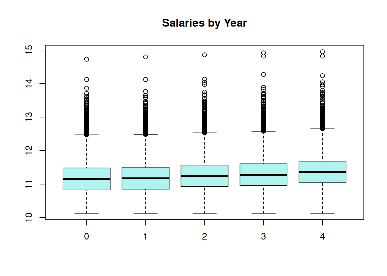
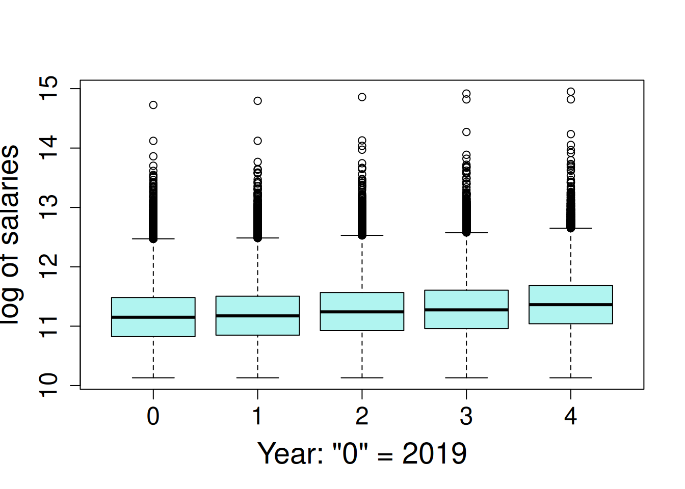
Employee salary is very skewed, where the 70% of salaries are less than $100,000, but there are a few very high salaries, up to a maximum of $3.1 million. The salaries were log transformed for a log-linear model. This is a special case of generalized linear mixed model (GLMM); log-linear model follow the assumption of normally-distributed residuals terms when the dependent variable is log-transformed. The salaries are observed to increase a small amount each year.
hist(log(wa_salary$salary), ylab = NA, main = NA,
     xlab = "log of salaries")

boxplot(log(salary) ~ year, data = wa_salary, main = NA,
        ylab = "log of salaries", xlab = 'Year: "0" = 2019')
The analysis is from this model where random intercepts and slopes were fit for institution and individuals nested within institution.
\[Y_{ijk} = \mu + \alpha_i + \beta_j + \gamma_k + \delta_jX_{ij} + \zeta_kX_{ik} + \epsilon_{ijk}\] \(\mu\) = model intercept
\(\alpha_i\) = fixed effect of year (5 levels, treated as categorical)
\(\beta_j\) = random intercept of institution (36 levels)
\(\gamma_k\) = random intercept of individual nested within institution (46164 total levels)
\(\delta_j\) = random slope of change over years for each institution
\(\zeta_k\) = random slope of change over years for each individual
\(\epsilon_{ijk}\) = error term
lme4 Syntax
- Run the model
m1 <- lmer(log(salary) ~ factor(year) + (year|agency/id),
           data = wa_salary, REML = FALSE)
Due to the size of the data set, we cannot display the residual plot because it takes too long to render.
- Obtain the BLUPs:
random_effects <- REextract(m1)- Save all object to file for later usage:
save(m1, wa_salary, random_effects, file = here::here("data", "salary_modeldata.RData"))14.1.2.2 Inference
14.1.2.2.1 1. Variance Components
VarCorr(m1) Groups Name Std.Dev. Corr
id:agency (Intercept) 0.473969
year 0.079368 -0.368
agency (Intercept) 0.087550
year 0.016624 -0.674
Residual 0.158676 Interestingly, there is a negative correlation between the intercepts and slopes for both institutions and individual employees. The higher the starting salary, the less it increased over time.
var_comps_salary <- tidy(m1, "ran_pars", scales = "vcov") |>
  filter(grepl("^var.*", term)) |>
  dplyr::select(group, term, variance = "estimate") |>
  mutate(`percent variance` = round(variance/sum(variance) * 100, 1))

var_comps_salary
# A tibble: 5 × 4
group term variance `percent variance`
<chr> <chr> <dbl> <dbl>
1 id:agency var__(Intercept) 0.225 85.1
2 id:agency var__year 0.00630 2.4
3 agency var__(Intercept) 0.00767 2.9
4 agency var__year 0.000276 0.1
5 Residual var__Observation 0.0252 9.5Unsurprisingly, individual employee is the most impactful factor on salary variance (under the conditions of this analysis).
14.1.2.2.2 2. BLUPs
# the model intercept
intercept = fixef(m1)[1]

# all random effects from the model
random_effects <- REextract(m1)
14.1.2.2.3 3. Visualize Random Effects
(intercepts and slopes)
- Filter BLUPs to a single factor, “agency” (i.e. institute of higher education).
agency_re <- filter(random_effects, groupFctr == "agency") |>
  rename(Institution = groupID, BLUP = "(Intercept)", SE = "(Intercept)_se") |>
  mutate(blup_adj = BLUP + intercept) |>
mutate(`salary slope` = ifelse(year > 0, "+", "-"))- Plot Salaries by Institution:
ggplot(agency_re, aes(x = reorder(Institution, blup_adj), y = blup_adj)) +
  geom_hline(yintercept = intercept, color = "gray", linetype = 2) +
  geom_linerange(aes(ymax = blup_adj + SE, ymin = blup_adj - SE)) +
    geom_point(size = 3, col = "violetred", shape = 18, alpha = 0.6) +
  labs(title = "Institutional Salaries, 2019 - 2024", subtitle = "Log of Salaries") +
  ylab("BLUP + mean and standard error") + xlab("institution") +
  theme_classic(base_size = 14) +
  theme(axis.text.x = element_blank(),
        axis.ticks.x = element_blank())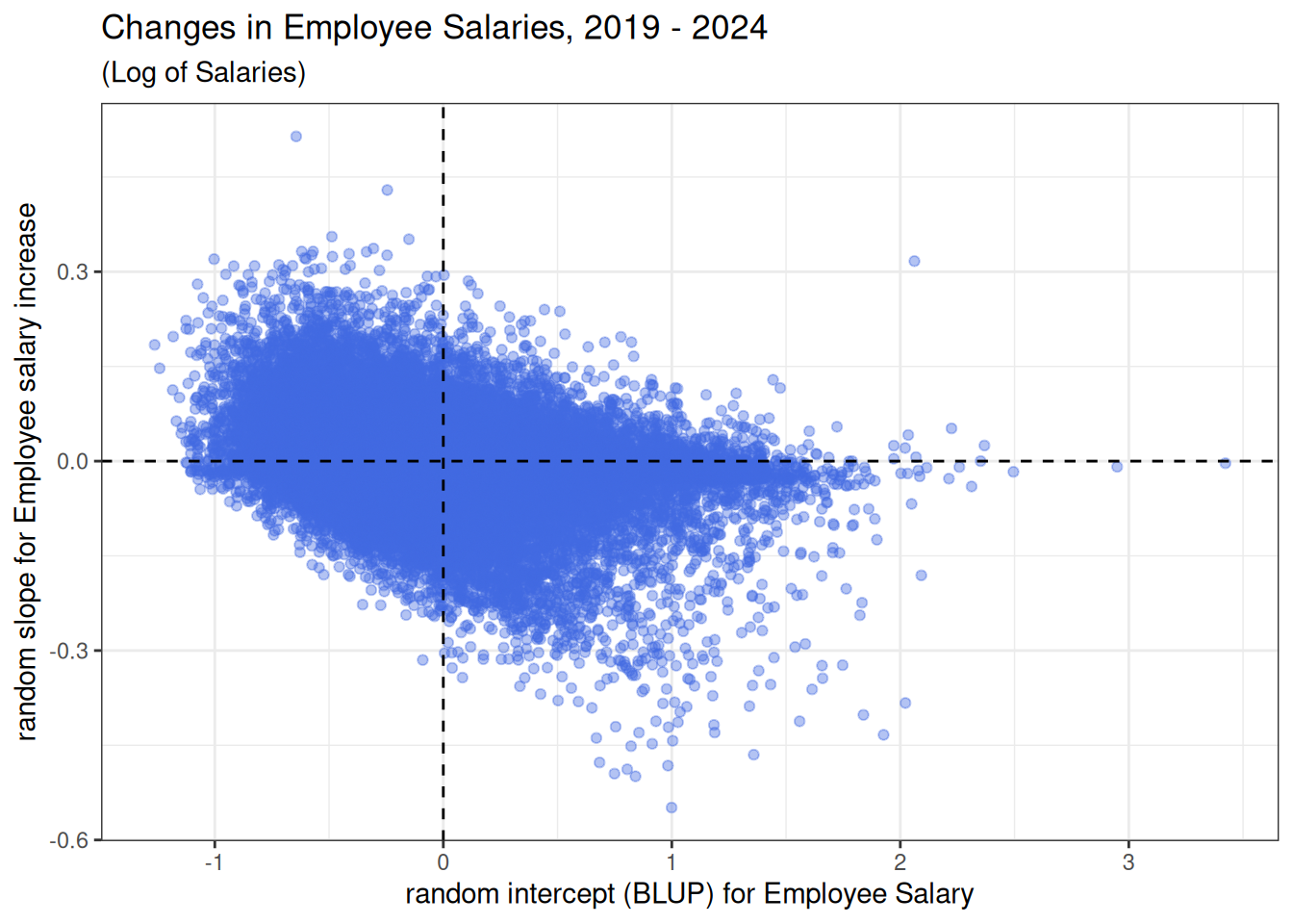
- Plot Salary Changes by Institution:
ggplot(agency_re) +  # need sequence -0.4 to 0.4
  geom_abline(aes(slope = year, intercept = blup_adj, col = `salary slope`), alpha = 0.7, linewidth = 0.75) +
  geom_hline(yintercept = intercept, color = "black", linetype = 2) +
  labs(title = "Changes in Institutional Salaries, 2019 - 2024", subtitle = "Log of Salaries") +
  xlim(c(0, 4)) +
  ylim(c(10.75, 11.3)) +
  scale_color_manual(values = c("springgreen3", "violetred")) +
  #ylim(c(-0.25, 0.3)) +
  ylab("log salary") + xlab("year") +
  theme_bw(base_size = 14) +
  theme(legend.position = c(0.98, 0.98),
        legend.justification = c(1,1),
        legend.background = element_rect(color = "gray60", fill = rgb(1, 1, 1, alpha = 0.8)),
        legend.key = element_rect(fill = "transparent"))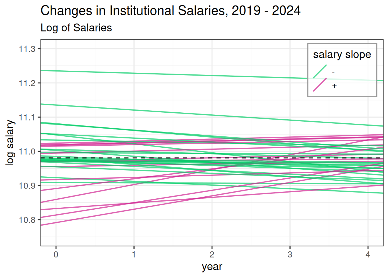
- Examine Relationship Between Employee Salary and Changes in Salary:
person_re <- filter(random_effects, groupFctr == "id:agency") |>
  rename(employee = groupID, BLUP = "(Intercept)", SE = "(Intercept)_se") |>
  mutate(blup_adj = BLUP + intercept) |>
mutate(`salary slope` = ifelse(year > 0, "+", "-"))ggplot(person_re, aes(x = BLUP, y = year)) +
geom_point(alpha = 0.4, color = "#064D87") +
geom_hline(yintercept = 0, col = "black", linetype = 2) +
geom_vline(xintercept = 0, col = "black", linetype = 2) +
labs(title = "Changes in Employee Salaries, 2019 - 2024", subtitle = "(Log of Salaries)") +
xlab("random intercept (BLUP) for Employee Salary") +
ylab("random slope for Employee salary increase") +
theme_bw(base_size = 14)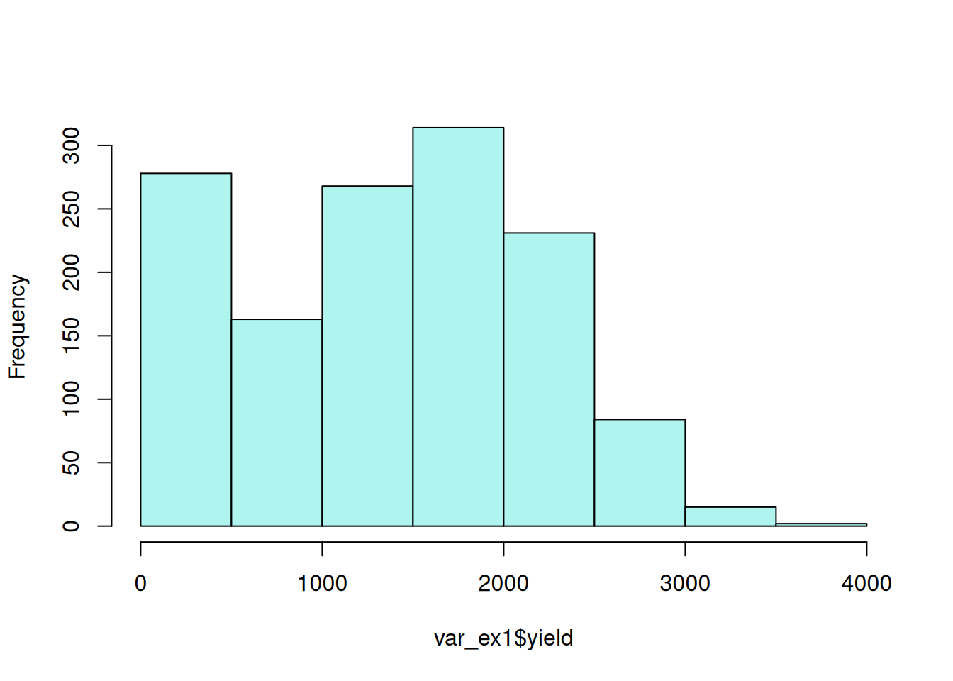
This plot illustrates the negative correlation between employee salary and employee salary change indicated by the VarCorr(m1) output.
There are other functions in merTools to explore random effects and variances from an lme4 analysis.
14.2 Variance estimation under heteroscedasticity
In the “general” linear model days, when a premium was placed on the i.i.d. error paradigm, if we did reject \(H_0\), it would set off a minor crisis in the form of a hunt for a variance stabilizing transformation. In contemporary modeling, we simply proceed with inference on estimable functions using the unequal variance model.
– Walt Stroup, Marina Ptukhiuna and Julie Garai (2024), Generalized Linear Mixed Models, 2nd Ed, Section 7.2.3.1
In previous sections, we have assumed the error terms or residuals were “i.i.d.”, that is “independently and identically distributed.” This means they shared the same distribution (~identical) and were uncorrelated (~independent). Longitudinal studies (i.e. those with repeated measures) do have correlated residuals, so we relax the independence assumption and model those correlations. However, residuals can be unexpectedly related to the their observations, particular treatments or the order data was gathered from the experimental units (among other causes). As mentioned in the previous quote, we now have tools for handling this rather than trying to transform the data. Below are examples on how to model heteroscedasticity.
14.2.1 Case 1: Unequal variance due to a factor
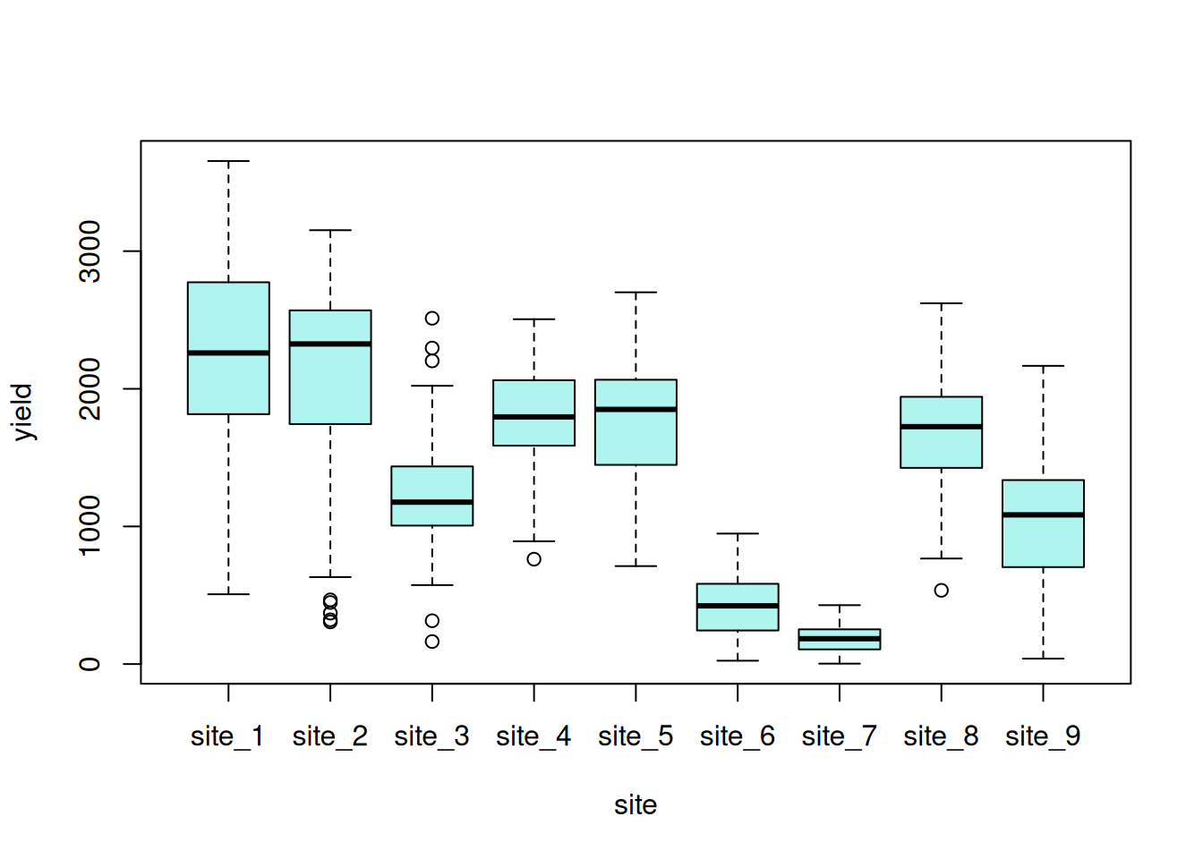
This data set consists of a set of canola variety trials conducted within a single year across multiple locations – sometimes called an multi-environment trial (MET). The trials consist of 38 canola varieties that were evaluated at 9 locations using a RCB design. The goal is to estimate varietal performance at each location as precisely as possible.
var_ex1 <- read.csv(here::here("data", "MET_trial_variance.csv")) |>
mutate(block = as.character(block))| site | location of trial, 9 levels |
| block | within trial replication, 4 levels |
| variety | canola genotype |
| yield | oilseed yield |
Exploratory data visualizations indicate that the dependent variable, seed yield, varied greatly overall, and certain locations had noticeably smaller variance compared to others.
hist(var_ex1$yield, main = NA, ylab = NA, xlab = "seed yield")
boxplot(yield ~ site, data = var_ex1)
14.2.1.1 Model Fitting
This is a fully crossed design; all varieties were evaluated at all sites. However, there is missing data, as is common in agricultural field trials. For this analysis, variety and variety-by-site are fixed effects while site and block are random effects.
\[ y_{ijk} = \mu + \alpha_i + \beta_j + (\alpha\beta)_{ij} + \gamma_k + \epsilon_{ijk}\] \(\mu\) = model intercept
\(\alpha_i\) = fixed effect of variety (38 levels)
\(\beta_j\) = random effect of site (9 levels)
\((\alpha\beta)_{ij}\) = fixed effect of variety-by-site interaction (342 levels)
\(\gamma_k\) = random effect of block (36 levels)
\(\epsilon_{ijkl}\) = error term
The error terms and all random effects are normally distributed with a mean of zero and a given variance for each term:
\[ \epsilon \sim \mathcal{N}(0, \sigma^2) \] \[ \beta \sim \mathcal{N}(0, \sigma^2_b) \] \[ \gamma \sim \mathcal{N}(0, \sigma^2_S) \]
ex1_m1 <- lme(yield ~ site:variety + variety,
                random = ~ 1 |site/block,
                na.action = na.exclude,
                data = var_ex1)
The residual plot indicates some association between the residuals and fitted values, violating the i.i.d. model assumption.5
5 Since the focus of this section is on evaluating the homoscedasticity assumption, the ‘nlme’ residual plotting function is used for its simplicity of display.
plot(ex1_m1)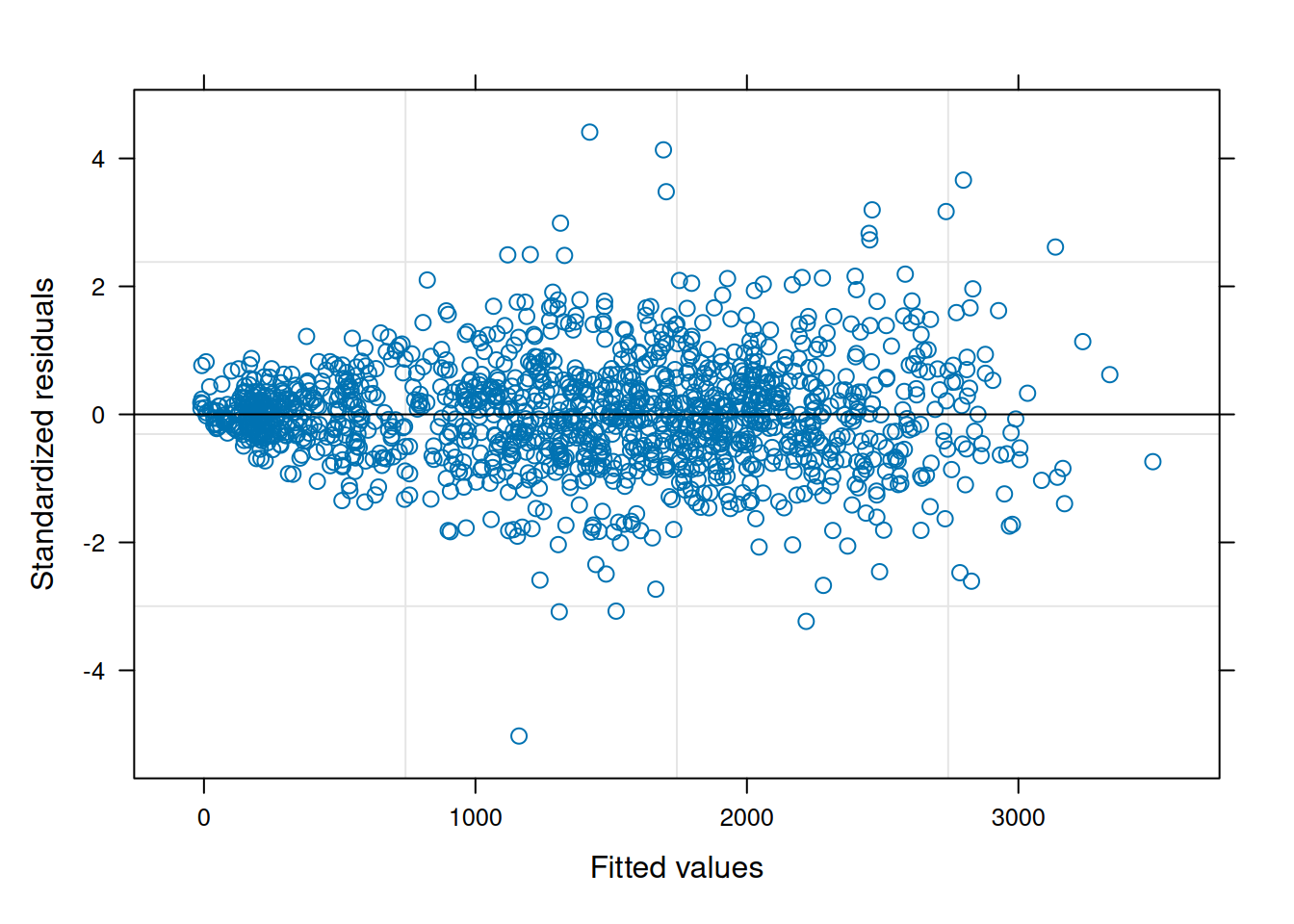
We can add a term, \(\delta\) to model the variance by site.
\[Var(\epsilon_{ij}) = \sigma^2 \delta^2_{s_{ij}} \] The package ‘nlme’ contains a relatively straightforward implementation for heteroscedasticity. Details on the implementation can be found in Pinheiro and Bates (2000).
ex1_m2 <- update(ex1_m1, weights = varIdent(form = ~1|site))The function varIdent() is used to set the stratifying variable at which to estimate variance. Like many functions in R, there are additional arguments to consider for more complex scenarios (type ?varIdent in an R console to check).
The residual plot from this updated model is now much cleaner and conforms to expectations.
plot(ex1_m2)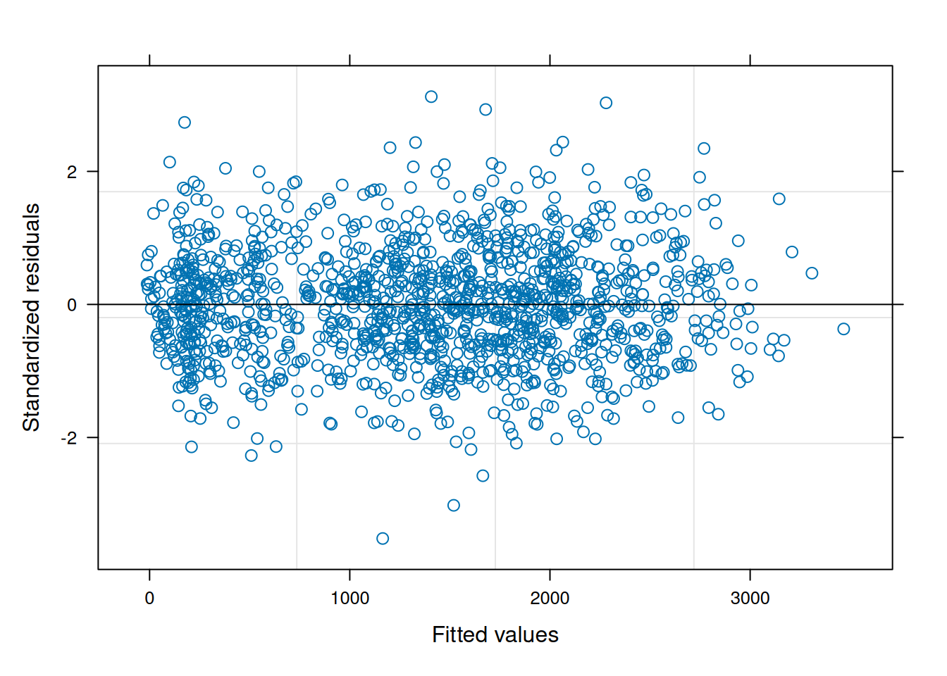
When comparing the models with a log-likelihood ratio test, the model with heterogeneous error structure has better fit statistics and is different from the unweighted model (\(p<0.0001\)).
anova(ex1_m1, ex1_m2) Model df AIC BIC logLik Test L.Ratio p-value
ex1_m1 1 345 14814.25 16511.55 -7062.128
ex1_m2 2 353 14489.23 16225.88 -6891.615 1 vs 2 341.0259 <.0001The result is a better-fitting model and with that, better inference for variety at the site level.
While it may be possible to implement heterogeneous error structures with ‘lme4’, it requires a good working knowledge of that R package.
14.2.2 Case 2: Variance is related to the fitted values
The residuals from this example illustrate the infamous ‘horn’ pattern that can occur im the residuals-vs-fitted values plot. This analysis is from a canola variety trial of 38 cultivars conducted at single location for one field season.
var_ex2 <- read.csv(here::here("data", "single_trial_variance.csv")) |>
dplyr::mutate(block = as.character(block))| block | replication, 4 levels |
| variety | canola genotype, 38 levels |
| yield | oilseed yield |
A histogram does indicate there is anything unusual about the dependent variable (seed yield), except that is varies quite a bit, ranging from 24 to nearly 950 units.
hist(var_ex2$yield, ylab = NA, xlab = "seed yield", main = NA)Since this experiment has a single fixed effect and is arranged using a RCBD, the model is same as described in the RCBD chapter.
ex2_m1 <- lme(yield ~ variety,
               random = ~ 1 |block,
               na.action = na.exclude,
               data = var_ex2)
An inspection of the residual plot indicates a clear mean-variance relationship.
plot(ex2_m1, pch = 16, col = rgb(6/255, 77/255, 135/255, 0.6))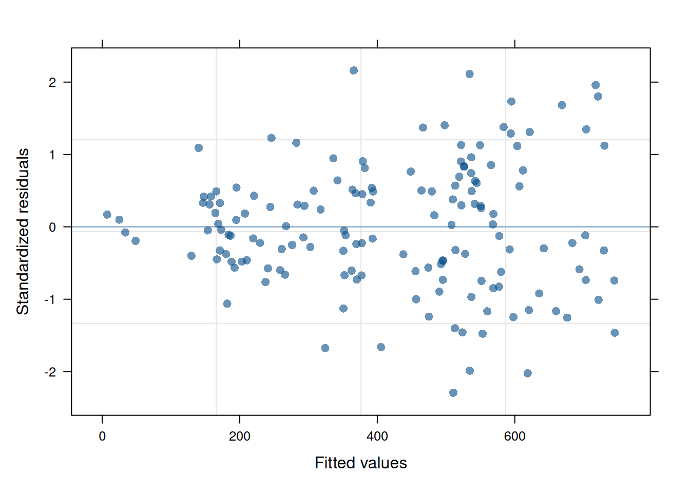
This mean-variance relationship can be mitigated by modeling the variance directly as a function of any covariate in the model using a power function:
\[ Var(\epsilon_{ij}) = \sigma^2|\nu_{ij}|^{2\delta}\] We can accomplish this using the ‘nlme’ function varPower(). This function can take any model covariate, but when there is no argument provided, it defaults to using the fitted values.
ex2_m2 <- update(ex2_m1, weights = varPower())The model fit is substantially improved according to visual inspection of the residuals and the results of a likelihood ratio test.
plot(ex2_m2, pch = 16, col = rgb(6/255, 77/255, 135/255, 0.6))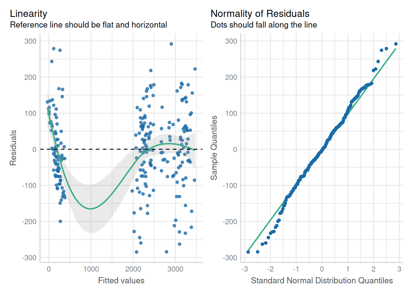
anova(ex2_m1, ex2_m2) Model df AIC BIC logLik Test L.Ratio p-value
ex2_m1 1 40 1545.596 1655.044 -732.7978
ex2_m2 2 41 1519.199 1631.383 -718.5996 1 vs 2 28.39636 <.0001There are many other ways of using these functions for modeling heteroscedasticity. For example, varIdent() can include a covariate, and varPower() can include a stratifying variable. All or some of the parameters can be fixed at set values. It’s worth reading the documentation to understand what is possible.
14.2.3 Case 3: Variance is related to a factor under other complex circumstances
Recall the repeated measures split-split plot example that indicated some evidence of heteroscedasticity. The model passed a Breusch-Pagan test, but these tests are imperfect, and it may be worthy to investigate if modelling heteroscedasticity improves the model fit.
The first step is to reload the data:
load(here::here("data/phos_fit1.RData"))Retrieve the original data set
phos1 <- getData(pfit1)
head(phos1)
plot bloc Ptrt Inoc Cv time P_leaf time_num rep
1 1 1 high none Louise PT1 3153.56 1 1
2 1 1 high none Louise PT2 2330.62 2 1
3 1 1 high none Louise PT3 246.94 3 1
4 2 1 high none Blanca Grande PT1 3015.97 1 1
5 2 1 high none Blanca Grande PT2 2160.43 2 1
6 2 1 high none Blanca Grande PT3 116.58 3 1Here is the original model:
corr_str1 = corCompSymm(form = ~ time_num|rep/Ptrt/Inoc/plot, value = 0.2, fixed = FALSE)

pfit1 <- lme(P_leaf ~ time*Ptrt*Inoc*Cv,
                random = ~ 1|rep/Ptrt/Inoc/plot,
                corr = corr_str1,
                data = phos1, na.action= na.exclude)
While each time point appears to have different variance, the model residual plot is not obviously raising red flags of unequal variance. At this point, we have ambiguous evidence that there may be a problem with the variance across time points.
par(mar=c(4.1, 4, 2.1, 2.1))
par(mfrow = c(1, 2))

boxplot(P_leaf ~ time, data = phos1, col= base_plot_color, ylab = "dependent variable", xlab = "time point", main=NA)

plot(fitted(pfit1), residuals(pfit1, type = "pearson"), ylab = "residuals", xlab = "fitted values", col = "maroon"); abline(h = 0, lty = 2, lwd = 1.5)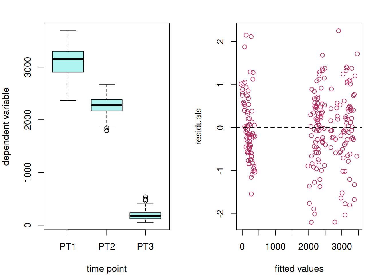
Given this uncertainty, it is worth exploring modelling heteroscedasticity. As shown earlier, we can model the variance as a function of a variable by using the varIdent() function.
pfit2 <- update(pfit1, weights = varIdent(form = ~1|time_num))par(mar=c(4.1, 2, 2.1, 4.1))
par(mfrow = c(1, 2))
plot(fitted(pfit2), residuals(pfit2, type = "pearson"), ylab = NA, xlab = NA, col = "maroon", ylim = c(-2.5, 3), main = "heteroscedasticity"); abline(h = 0, lty = 2, lwd = 1.5, ylim = c(-2.5, 3))
#plot(pfit2, col = "maroon")
plot(fitted(pfit1), residuals(pfit1, type = "pearson"), ylab = NA, xlab = NA, col = "maroon", ylim = c(-2.5, 3), main = "homoscedasticity"); abline(h = 0, lty = 2, lwd = 1.5)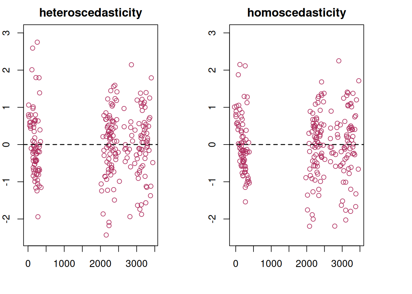
These side-by-side plots indicate that modeling heteroscedasticity had a minor impact on the results, which is confirmed by a log likelihood ratio test comparing the two models.
anova(pfit1, pfit2) Model df AIC BIC logLik Test L.Ratio p-value
pfit1 1 66 2511.987 2722.722 -1189.993
pfit2 2 68 2508.314 2725.435 -1186.157 1 vs 2 7.672945 0.0216This change impacts the standard errors slightly.
suppressMessages({
  em1 <- as.data.frame(emmeans(pfit1, ~ time)) |> mutate(model = "equal variance")
  em2 <- as.data.frame(emmeans(pfit2, ~ time)) |> mutate(model = "unequal variance")
})

bind_rows(em1, em2) |> dplyr::select(model, time, emmean, SE, df) |> arrange(time, model) |> mutate(across(c("emmean", "SE"), ~ signif(.x, digits = 4)))
model time emmean SE df
1 equal variance PT1 3096.0 47.22 3
2 unequal variance PT1 3096.0 39.92 3
3 equal variance PT2 2270.0 47.22 3
4 unequal variance PT2 2270.0 39.48 3
5 equal variance PT3 197.6 47.22 3
6 unequal variance PT3 197.6 37.57 3In situations like this when there is evidence that either model may be appropriate, it is up to the researcher to decide which works best for their circumstances.
NoteCoefficient of Variation and LSD
The coefficient of variation can be manually calculated as thus:
\[ \frac {\sigma}{\mu} * 100 \]
ex1_ave <- mean(var_ex1$yield, na.rm = TRUE)
ex1_cv = sigma(ex1_m1)/ex1_ave*100
round(ex1_cv, 1)
[1] 14.4However, in cases of unequal variance, the overall error term can be larger than expected under homoscedasticity (with varIdent()) or much much smaller (e.g. with varPower()). Interpret the coefficient of variation from mixed models with caution.
Related is Fisher’s least significant difference, i.e. LSD. While most mixed modelling packages do not calculate this (e.g. ‘nlme’, ‘lme4’/‘lmerTest’ or any SAS mixed modeling procedure), there are some add-on packages that will. This is generally not recommended for reasons of multiple testing. However, LSD output is strongly discouraged in the case of heteroscedasticity; since there is unequal variance, it is not possible to set a global difference that can apply to all possible pairwise comparisons of factor levels.